


OneUI Fluffy Icons
4.436.00 Reviews
App Specs
- Version
- 1.8
- Updated On
- License
- $1.99
- Downloads
- 10,000+
- Developer
- AppixoStudio
- Categories
- Personalization
- Platform
- Android
Screenshots
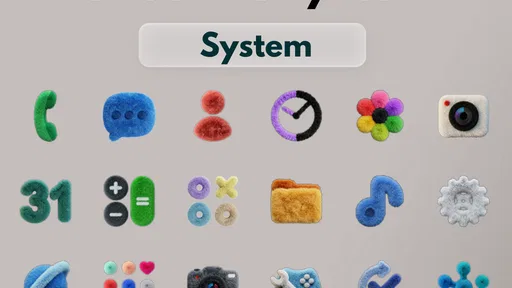
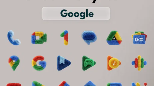
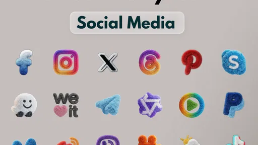
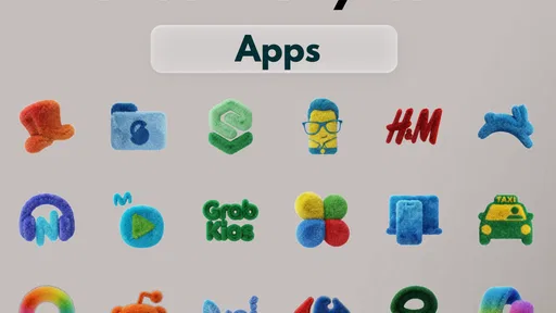
 Analysis by AppCompare
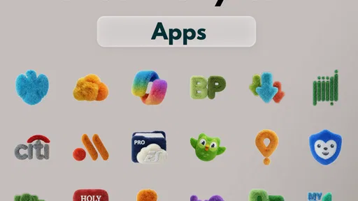
I judge an icon pack by what I see during ordinary phone use, not just by a polished preview: whether the home screen feels more personal, whether the new look stays easy to scan, and whether the price makes sense for a visual change. OneUI Fluffy Icons aims for a soft, rounded appearance inspired by Samsung’s One UI style. It is a paid personalization app from AppixoStudio, so the key question is whether that specific look is worth choosing over a free pack or the icons already on your phone.
What the paid pack changes—and what it doesn’t
There is no free version of this app to weigh against its paid edition: the listed price is $1.99, with in-app purchases ranging from $0.99 to $3.49 per item. I would treat those as separate costs rather than assume the initial purchase includes every optional item. If you are deciding whether to spend anything, first check what the base purchase gives you and whether the additional items are relevant to your setup. That simple check matters more than a promise of a particular number of icons or a feature you may never use.
Pay for a look you will see every day
An icon pack is a small, highly visible change. You encounter it when opening messages, checking a calendar, or finding a camera app, so a consistent style can make the home screen feel considered without changing how the phone works. Here, the appeal is the plush, rounded treatment rather than a new launcher or a bundle of productivity tools. If that look makes you enjoy unlocking your phone, the one-time listed price may feel reasonable; if you tend to change themes every few days, the value is less certain.
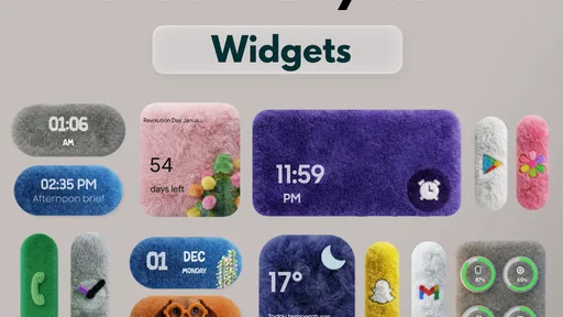
The practical benefit depends on your launcher and how you arrange apps. An icon pack does not automatically make every screen feel cohesive: widgets, wallpapers, folders, and icons that are not covered can still look different from one another. I’d start with a familiar home screen and apply the pack before reorganizing everything. That lets you judge whether its visual style works with your current wallpaper and widget colors, rather than confusing the icon change with a complete redesign.
Where the style earns its keep
The best use case is a home screen where the icons are easy to spot but the default set feels too plain or visually mixed. A softer, rounded design can make a grid feel friendlier, especially if you prefer a playful look over sharp, minimal symbols. It is also a relatively low-effort way to give an older-looking layout a fresh mood: you can keep the same app order and habits while changing the visual character of the screen.
One useful way to test the pack is to apply it to your main home screen first, then use the phone normally for a day. Pay attention to the apps you reach for quickly. If the new artwork makes two icons harder to distinguish, adjust the layout or keep those apps in a folder you can identify at a glance. A cohesive pack is attractive, but recognition is more important than matching every shape perfectly.
Price, fit, and the alternatives
The app has an Everyone content rating, a 4.5 average from around 1,100 ratings, and more than 10,000 installs. Those figures suggest that other users have tried it, but they cannot tell you whether you will like its particular aesthetic or whether it will suit your launcher. It was released on December 3, 2025, and version 1.5 is the current version. Android 5.0 is the minimum operating system requirement, which makes the stated baseline broad, though launcher support still matters in practice.
Worth Reading Before You Choose

Flipboard Shows What News Apps Must Do Beyond the Feed

Switching to Android Auto Means Rethinking Your Driving Routine
Google Calendar Makes a Crowded Week Easier to Manage
Ludo King Makes the Most of the Minutes Between Plans

Baby Panda World Brings Quick Play to Modern Phones, but Its Game Library Feels Busy

ESPN’s Live Game View Makes Following Close Games Easier
Compared with using a phone’s default icons, this pack offers a more distinctive visual direction, but the default set has the advantage of being familiar and already aligned with the system. Free icon packs are the obvious alternative if you are mainly experimenting; they let you try different styles without paying, though their designs and presentation may not match what you want. A full theme or launcher setup can change more of the interface, but it also involves more decisions and may alter familiar home-screen behavior. I would choose this pack when the fluffy icon style itself is the main thing I want, not when I am looking for a complete redesign.
Small choices that make a difference
Before committing to a full layout change, check whether the launcher you already use supports applying third-party icon packs. If it does, try the icons without moving widgets or rebuilding folders. If it does not, the pack may not be useful with your current setup, and switching launchers just for an icon style may be more trouble than the purchase is worth. On a Samsung phone, also confirm how your preferred home-screen setup handles icon packs rather than assuming that a One UI-inspired look guarantees compatibility with every system configuration.
For a cleaner result, I would pair the icons with a relatively calm wallpaper and avoid changing icon size, grid spacing, and widget arrangement all at once. Make one adjustment, use the phone for a while, then decide whether another is needed. This makes it easier to spot what is improving the screen and what is making it harder to navigate. If some apps retain their original artwork, grouping less-used ones in a folder can reduce the visual mismatch without hiding the apps you need most.
Who should skip it
This is not the right choice if your first priority is function rather than appearance, if you strongly prefer the stock look, or if you do not want to spend on a cosmetic change. It may also disappoint someone expecting every app icon to match automatically: icon packs depend on launcher support and on whether an app has a corresponding design. An unmatched icon can interrupt an otherwise consistent grid, so users who want a perfectly uniform screen should check their frequently used apps before settling on any pack.
I would also skip it if you are unwilling to adjust your setup at all. Applying an icon pack can be straightforward when the launcher supports it, but the final result still depends on the home screen around it. Someone who wants a whole new interface, custom widgets, and a matching lock screen may be better served by a broader theme or launcher solution. The appeal here is narrower and more focused: a soft icon treatment, not a guarantee that every part of Android will change with it.
A realistic day-to-day test
Imagine checking your phone while heading out: you want to tap maps, messages, and a calendar reminder without pausing to decode the icons. I would place those frequent apps where they already are, apply the pack, and see whether their new artwork remains instantly recognizable. Then I would check the same screen in different lighting and with the wallpaper I actually use. That quick routine tells you more about everyday value than inspecting a grid of icons in isolation.
There is also a useful distinction between a home-screen makeover and a system-wide change. An icon pack can affect the places where a compatible launcher displays app icons, but it should not be treated as a promise to restyle every menu or screen. If what you want is a consistent set of symbols on your launcher, that limited scope is a benefit: it keeps the change focused. If you expect the entire phone interface to become fluffy, the purchase is unlikely to meet that expectation.
My value judgment
For me, the strongest reason to pay is not a claim about how many icons are included; it is whether this particular rounded style is exactly the personality I want on my home screen. I would compare the base price with the free alternatives I actually like, then decide whether the polish and visual consistency justify paying. The extra in-app purchase range makes it sensible to check the separate items before spending beyond the initial purchase. I would not buy on the assumption that optional purchases are necessary, or that the base purchase includes something that has not been clearly described at checkout.
My practical recommendation is to consider it if you already use a compatible launcher, enjoy soft and playful artwork, and are comfortable paying for a focused cosmetic change. If you are unsure, compare a few free packs first and think about the icons you use most. The choice is less about whether fluffy icons are objectively better and more about whether this look makes your own screen feel more inviting without making your apps harder to find.
Have you ever scrolled through your phone and thought, "Man, these icons could use a little spice"? Well, my friend, you're in luck because OneUI Fluffy Icons is here to jazz up your home screen with a playful twist.
First Impressions
So, let's dive in. When I first installed OneUI Fluffy Icons, I was immediately struck by how fun and vibrant everything looked. The icons have this adorable puffiness to them that makes each app feel like it's wrapped in a cozy little cloud. It's like your phone got a plush makeover, and honestly, who doesn't love a good makeover?
Setting It Up
Getting started with these icons is a breeze. You simply install the app, and it seamlessly integrates with most Android launchers. I tried it with Nova Launcher and it worked like a charm. There’s a nifty little tutorial that guides you through the setup, so even if you're not a tech wizard, you’ll be up and running in no time.
Features and Customization
One of the standout features is the sheer variety in the icon pack. There are over 2000 icons to choose from, covering pretty much every app you can think of. And the best part? Each icon is carefully crafted to ensure it blends perfectly with the rest of the pack. You can also tweak the size of the icons, which is great if you want to personalize your layout just a bit more.
The app also lets you change folder icons, which I found incredibly useful. I mean, who knew organizing your apps could be this adorable? Plus, with regular updates, new icons are added frequently, keeping things fresh and exciting.
Performance
Now, let’s talk performance. I was a bit worried that such detailed icons might slow down my phone, but I’m happy to report that wasn’t the case. The app is lightweight and doesn't hog resources, so you can enjoy the fluffy goodness without any lag. It’s like having your cake and eating it too, except the cake is your home screen and it’s calorie-free!
Compatibility
OneUI Fluffy Icons plays nicely with a range of launchers, including Nova Launcher, Apex Launcher, and even the standard Samsung One UI if you’re using a Samsung device. This versatility means you won't have to switch up your launcher to enjoy the icons, making it a convenient option for most users.
Why It’s Worth It
So, why should you consider giving OneUI Fluffy Icons a spin? For one, it injects a sense of fun and personality into your device that standard icons just can’t match. It’s perfect for those who want their phone to reflect a bit more of their playful side. Plus, the regular updates mean you’re not stuck with the same look for too long, keeping your screen feeling fresh.
In conclusion, if you're on the hunt for a way to elevate your phone’s aesthetic with minimal effort, OneUI Fluffy Icons is definitely worth checking out. It’s user-friendly, visually appealing, and downright delightful. Go ahead, give your phone the fluffy treatment it deserves. You might just find yourself smiling every time you unlock your screen.
Pros
- Unique
- eye-catching design.
- Highly customizable icons.
- Regular updates with new icons.
- Compatible with many launchers.
- Supports high-resolution displays.
Cons
- Limited free icons available.
- Requires a third-party launcher.
- No widget support included.
- Can slow down older devices.
- Premium icons are pricey.
FAQs for OneUI Fluffy Icons
What are OneUI Fluffy Icons?
OneUI Fluffy Icons is a customizable icon pack for Android devices that offers a unique, soft, and rounded design. It transforms the standard app icons into a more playful and visually appealing style, catering to users who prefer a more personalized and aesthetically pleasing interface.
How do I install OneUI Fluffy Icons on my device?
To install OneUI Fluffy Icons, you must first download a compatible launcher from the Google Play Store, such as Nova Launcher or Apex Launcher. Once installed, you can apply the icon pack through the launcher's settings. This will replace the default icons with the Fluffy design.
Are OneUI Fluffy Icons compatible with all Android devices?
While OneUI Fluffy Icons is compatible with a wide range of Android devices, it requires a third-party launcher to function properly. Most modern Android devices support these launchers, but it's recommended to check your device's compatibility with the specific launcher you choose to ensure seamless integration.
Do OneUI Fluffy Icons affect device performance?
Using OneUI Fluffy Icons should not significantly affect your device's performance. However, performance can vary depending on the launcher's efficiency and your device's specifications. Generally, modern Android devices handle icon packs well, but it's always a good idea to monitor your device's performance after installation.
Is there a cost associated with OneUI Fluffy Icons?
OneUI Fluffy Icons may be available as a free download with optional in-app purchases for additional features or premium icons. It's important to check the Google Play Store listing for any costs involved and to ensure that you are downloading from a reputable source to avoid any unwanted charges.


